ARISTA EXPLAINS; HOW TO PICK THE PERFECT COLOUR PALETTE

We’re starting a new series for this blog! Every few weeks we’ll cover a topic related to design or to sleep, in a segment we’re calling Arista Explains. Today we’re covering one of the most basic parts of interior design; picking out colours.
There are some colour schemes that always work well- neutrals and cream tones are never difficult to put together and to make look good, but if you want to push the envelope a little, you need a working understanding of colour theory. Colour theory works by analysing the colour wheel, which you’ll have seen loads of in art classes at school. You can use the wheel to find colour combinations that work well together by using three different methods.

Triadic colour palettes are three colours evenly spaced on the wheel, like orange, purple and blue, which create a high contrast, bright palette.
Complementary colours are opposite on the wheel, like blue and orange or red and green, and are great high-contrast accent colours.
Analogous colours sit next to each other on the wheel and complement each other well- these are great for creating whole spaces and are really soothing when placed next to each other.
Whilst triadic and complementary colours do work, they can be really difficult to balance correctly, so they’re probably not ideal for a beginner. Analogous colours, however, are super easy to use and to do well, so they’re a really good bet for someone who’s just starting out in interiors.
A lot of the rooms you’ve seen and loved on our Instagram use this theory really well- take for example this space, from @at_home_with_clo, who uses a salmon pink and a forest green, complementary colours, to add contrast to her space. The reason this looks so soft and glamorous, rather than being overwhelming, is that she’s very careful to balance things out with a warm, neutral cream shade.

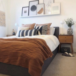
Another amazing example is this room from @dougs.digs- they’ve gone for a warm brown colour scheme, and they’ve been careful to use lots of different complementary tones. What this does is stop the room from feeling flat by adding visual interest and texture.

When you put it all into words, it can sometimes sound way more complicated than it actually is; the truth is that you’re probably already doing this subconsciously, so if this feels daunting, choose to see it more as a troubleshooting tool. Colour theory is an amazing way of figuring out why a space isn’t working well for you, and figuring out what to add or subtract, but don’t let it stifle your creativity or force you into an interior design box.
Tags: bed, Bedroom, bedroom furniture, beds, beds and mattresses, furniture, home, home furniture
