Amara Launch New Responsive-Design - Mobile Friendly Website!

Based in the UK, Amara is now the online market leader in the luxury home brand space; committed to sourcing the most prestigious and luxurious brands to host on their website and to deliver top quality customer service to their clientèle.
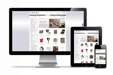
The original Amara website delivered exceptional results for the company; however, with the distinct trend towards users accessing their website via smart phones and tablets, the decision was made to update the site with a brand new responsive design, so that it can be viewed on all platforms.
Developed in-house the new website uses the latest web technology, Responsive Design, so that a web page will automatically resize and re-format itself dependent on the size of the browser. That means that rather than a user having to pinch in and out to view an image they will be able to see them listed automatically in an easy to view format. Smartphone and tablet usage is growing rapidly so this feature ensures Amara stays ahead of the game in terms of customer interaction.
Other website features include modern design and presentation of products along with links to independent reviews from Feefo. The site also allows customers to track their orders on-line via their account within the website.
Speaking from their offices, managing director Andrew Hood said: “It is our desire to offer the best possible customer experience at all times. The beauty of responsive web design is that it is quick and easy to update the site; one change will affect every platform as opposed to making the change several times”.
Check out our Responsive Design platform at Amara.co.uk